I've been meaning to write this post for an age but life events (mainly involving a guinea pig) keep interrupting pretty much all my plans, but here I be now.
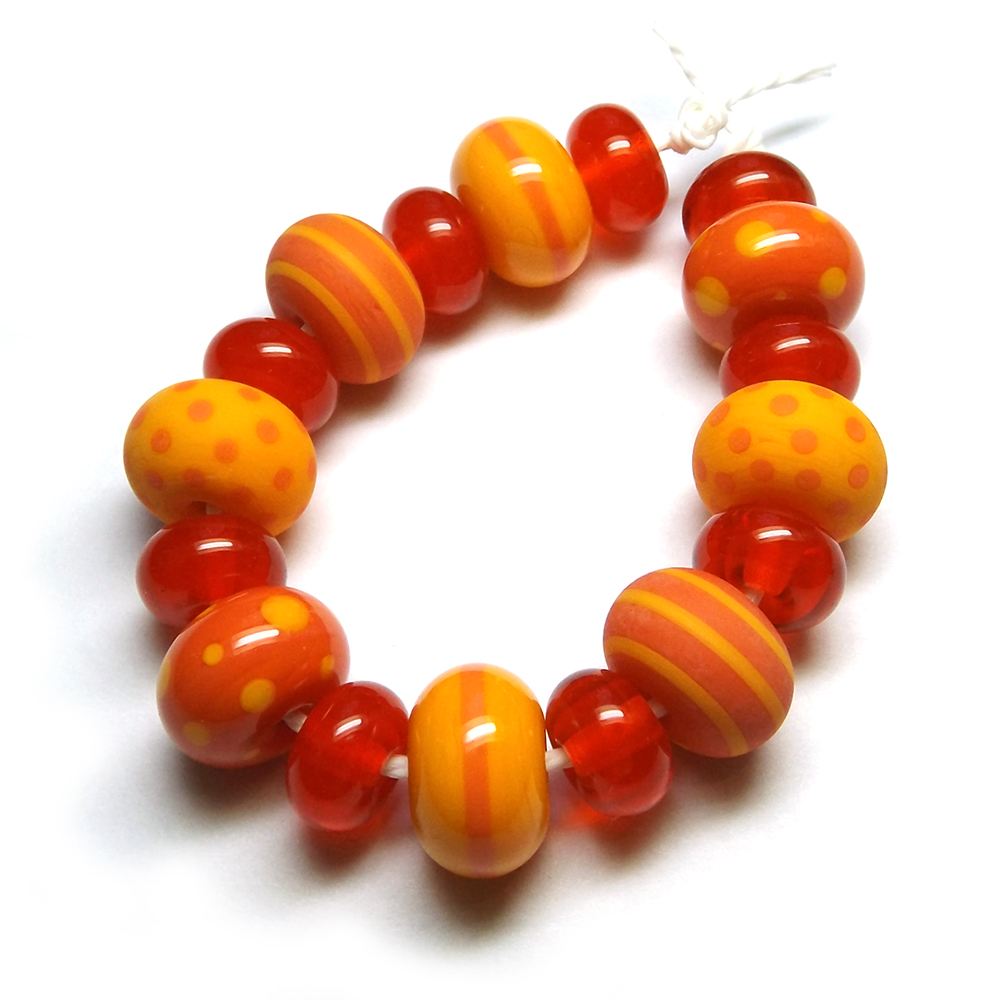
I've got three colours to talk about in this Creation Is Messy testing post - Sunset, a proper-proper orange, Daffodil, a bright, warm yellow and Bing, a transparent orange-red.
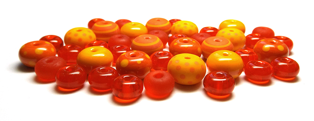
The photograph below shows Sunset and Daffodil both heavily and thinly encased with CiM clear and also as stringer.
Sunset is (in my head) what an orange glass should be. It's not streaky, it's not too bright and it behaves itself. I had no cracking issues when I encased it and like other CiM oranges such as the wonderful Creamsicle, it works wonderfully as stringer. You can't do stringerwork with Effetre orange. (I mean their actual opaque orange; not their countless 'corals'.)
CiM are also fab at yellow. I find the Effetre yellows to be either vile-looking or not opaque enough but Daffodil is just beautiful. It's a deep, vibrant yellow and again, it works perfectly as stringer and I had no encasing issues. That's right, a yellow that you can encase. I use CiM clear for encasing and have had no trouble encasing Daffodil, Hollandaise the Creamiscle-gone-yellow batch that floated about for a bit or Pumpkin. Some of those yellows are now no more but hey, those encasing funtimes were so good while they lasted.
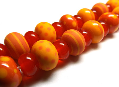
Both Sunset and Daffodil etch really well too. The 'Chilli' set at the top of this post, and also the beads above, feature both normal and etched beads.
Now for Bing. There always seems to be a transparent red in the CiM testing batches and as much as I adore red as a colour, I find it to be awkward as a glass; the opaques tend to get dark streaks (which is why I almost always dust it with red enamel in order to disguise that and achieve a uniform colour), the transparents need striking which is just annoying and can produce inconsistent colour results, and as a general rule, red and encasing mixeth not. So yes, I'm always a bit oh-it's-another-transparent-red and generally a bit meh when I get a red to test.
So imagine my delight when Bing turned out to be a NICE red to work with! It's actually pretty easy to get consistent colour results with it. I didn't encase it and I didn't decorate it. I only had one rod and I spent far too long just making spacers, marvelling at how easy it was to get lovely results. Bing has a orangeness about it which reminds me of strawberry tea. I was also able to make hearts with it which is normally a no with transparent reds because when I add the 'lobe' part of the heart I usually get a visible 'seam' where the base glass and lobe glass meet but NO, not with Bing. It also etches well.
To achieve consistent Bing colour results, I made a bead, brought it out of the flame until all the heat glow had disappeared plus about five seconds, then reheated it in the top section of my flame until a uniform redness covered the bead. Same as striking CiM Sangre, really.
To achieve consistent Bing colour results, I made a bead, brought it out of the flame until all the heat glow had disappeared plus about five seconds, then reheated it in the top section of my flame until a uniform redness covered the bead. Same as striking CiM Sangre, really.
All in all, these three colours are fab. If you love no-fuss, warm, fiery colours then all three of these are a must for your glass stash but you'll need to grab these whilst you can; all three are limited runs.


0 Comments
Post a Comment
Your comments are much appreciated. Fire away!