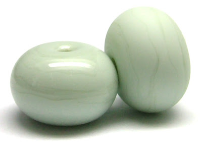
 I'm not a big drinker, in fact I hardly ever drink alcohol at all so when Creation Is Messy introduced Dirty Martini to their palette I had to have a Google to find out what makes a martini dirty. Turns out it's the addition of olive juice or brine to the normal gin and vermouth mix.
But CiM's Dirty Martini is alcohol free - it is a very pale green glass with just a hint of grey about it. Since it's been available it has been one of my favourite glasses as it is just so well behaved! It is a clean, crisp colour with a slightly stiffer consistency to it which makes it superb for encasing with transparent glasses as it holds its shape and doesn't drag about the place. The 'Apple & Blueberry' beads pictured below are Dirty Martini encased thinly with CiM Mojito - a proper cocktail of glass!
 I've heard some people say that they think Dirty Martini is a little too grey. On its own it does tend to look a bit pale but all you need to do to 'lift' it is to add stronger greens to the mix and I promise that this will make the Dirty Martini sing - the pale green beads in the 'Springtime' set below are a good example of this :
 I'm always on the hunt for new colours to use for my fine stringerwork. I actually have quite a limited palette when it comes to that because only a handful of glasses behave exactly as I need them to. I am super-pleased to discover that I can add Dirty Martini to my Perfect For Stringer List. The beads below have a core of CiM Oz encased in Mojito and the stringer is Dirty Martini. You can see that it keeps its definition, doesn't bleed or spread and it also yields that wonderful reaction line - the slightly darker line you can see running through the centre of the stringer on the scrollwork bead :
 So all in all I would say that Dirty Martini is a must-have colour. It's unlike any other shade in the 104 palette and it is absolutely wonderful to work with.
Thanks for all of the wonderful information Laura, you have saved me a lot of testing.
ReplyDeleteWow, I love all these beads but the ones right at the bottom are really special. I am thoroughly enjoying your reports on CIM colours and look forward to more.
ReplyDeleteI love how you share what other glasses you use in these color tests!
ReplyDeletePersonally I know nothing about beads and just come here for the eye-candy. Even so I enjoyed your explanation, especially of the 'reaction line'.
ReplyDeleteAnd those apple and blueberry beads are delicious..
omg. this is gorgeous. the gree/purple swirlies. what purple/blue? did you use? i love that. i'm guessing i need to put in a new order for CIM glass. love love!
ReplyDeleteThanks for taking the time to leave such fab comments!
ReplyDeleteThe purple-blue in the 'Apple & Blueberry' ones is Effetre Lavender/Lavender Blue. It's got several names but the number is 247.
Laura
I love your updates on these Laura, Dirty Martini is one of my favourite colours to use in designs, look forward to your next update
ReplyDeleteThese colors are gorgeous! You have great ideas.
ReplyDelete